

Overview
Air pollution is a pervasive, global issue worsening due to climate change, increasing population, deforestation, and other causes. Among the many types of air pollution, PM2.5 is known to be the most deadly (Cardenas 2021) and contributed to over 4 million deaths worldwide in 2019 (GBD 2019 Risk Factor Collaborators). PM2.5 consists of fine particulate matter smaller than 2.5 microns and poses significant health effects as it can enter the bloodstream.
Prior studies have found that proximity to sources of pollution is associated with increased risk of childhood cancer, cardiovascular and respiratory illnesses, end-stage renal disease, and diabetes (Brender, Maantay, and Chakraborty, 2011), but the breadth and extent of contemporaneous and long-term impacts of PM2.5 exposure on chronic health conditions among children is not well-understood.
We develop a causal model for estimating the effects of pollution exposure on pediatric health outcomes using variation in local air pollution driven by wind speed, wind direction, pollution emitted by pollution sites, and proximity of pollution sites to schools. We study these effects among the pediatric population in the state of California during the years 2002 through 2017.
Project Aims
We aimed to examine the link between PM2.5 pollution exposure and adverse pediatric health outcomes throughout the state of California from 2002 to 2017.
- Aim 1: Issues of air quality can affect all children. However, some may be disproportionately impacted by having high concentrations of PM2.5 at or near their school. To understand this issue better, we built unique high-quality data of PM2.5 pollution exposure at every school in CA.
- Aim 2: We established an empirical relationship between PM2.5 levels recorded at schools in CA and being upwind from key point sources of pollution.
- Aim 3: We estimated the causal effect of a school being located downwind from key pollution sources on select chronic health conditions among children under the age of 19.
- Aim 4: We conducted a counterfactual study to compare and quantify the benefits of various air pollution mitigation strategies.
Datasets
Wind
Wind data forms the basis for constructing our instrument, which predicts the amount of PM2.5 at each school. We find that as wind blows from a pollution source towards a school, we see higher levels of PM2.5 measurements.
The wind data used in our study comes from ERA5, which contains hourly wind observations measured every 31 km across the globe. Each measurement provides information such as wind direction and speed. For each school and pollution point source, we find the nearest wind measurement and use this information to predict PM2.5 levels at each school.
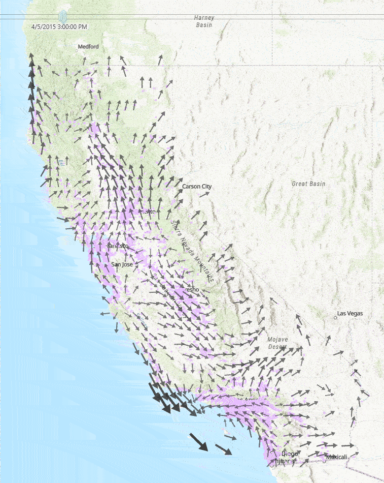
This diagram to the right shows a sample of a few hours of wind measurements across California. Faster wind speeds are represented by larger wind arrows, and purple points on the map represent each school used in our study.
Medical Diagnoses
Pediatric medical diagnosis data come from the California Department of Public Health (CDPH) and the California Office of Statewide Health Planning and Development (OSHPD). This dataset contains HIPAA-protected medical data on diagnoses and procedures for each hospital stay and ER visit in the state of California from 2000 through 2018. For our project, we aggregate these data to month and zip code levels and aim to predict the proportion of the population that will experience certain medical diseases.
Because we are not medical specialists, we consulted with medical doctors to better understand which pediatric health outcomes would be plausible to have causal links with PM2.5 exposure. Following research and discussion, we decided to focus on the following pediatric medical conditions in our study:
- Hematopoietic cancer
- Type 1 diabetes
- All malignant cancers
- All non-blood malignant cancers
- Cardiorespiratory cancer
- Blood diseases
- Blood vessel diseases
- Both blood and blood vessel diseases
- Injuries (used as a control diagnosis for which we expect to see no statistical significance)
PM2.5 Readings
PM2.5 data come from NASA MODIS, MISR, and SeaWIFS instruments and were assembled by researchers at Washington University in St. Louis. The data are collected using chemical transport modeling, satellite remote sensing, and ground-based monitoring.
This data visualization shows the average PM2.5 levels from 2000 through 2017. Only the zip codes which had an open school during the time period of our study (2002-2017) were considered in our analysis and are displayed in the graph. We observe that PM2.5 levels are generally the highest in Los Angeles County with average PM2.5 levels as high as 18 tons per year. Similarly, the Central Valley of California has also seen high levels of PM2.5 with average PM2.5 levels in the range of 12-17 tons per year.
Pollution Sources
In order to predict the levels of PM2.5 at each school, we looked at the 15 point sources of pollution geographically nearest to each school and the amount of PM2.5 emitted from each of those point sources. These data come from the National Emissions Inventory (NEI) provided by the Environmental Protection Agency (EPA), which contains information on stationary pollution point sources and the amount of PM2.5 emitted measured in tons per year (TPY).
The NEI list contains a wide variety of pollution point sources and the amounts of PM2.5 emitted. These sources are primarily large industrial facilities, power plants, airports, and commercial facilities. Some polluters emit over a thousand tons of PM2.5 per year, while others emit a very insignificant amount. To ensure that we adequately capture significant polluters, we filter the dataset to use only pollution point sources with PM2.5 emissions above 4 TPY.
The data visualization to the right maps these polluters, with larger dots representing those emitting higher amounts of PM2.5 each year. You can click and drag on the map to select a subset of polluters, and the histogram will update to represent the selected subset.

Schools
The California schools data come from both the California Department of Education and the California School Campus Database (CSCD), which supplemented the state data with better campus centroid information. The data set contains over 10,000 California schools ranging from kindergartens to high schools. Each record contains information such as the date the school opened, its closing date if applicable, school district, address, and grades offered.
We made the simplifying assumption that every child attends a school in the same zip code as their home and is exposed to the same amount of PM2.5 pollution. Our analysis uses the PM2.5 exposures measured at each school to predict the diagnosis rate of selected medical outcomes.
Population
Population data come from the U.S. Census Bureau. The Census Bureau performs an official census every 10 years. Thus, we used these official census counts for 2000 and 2010. Between the years 2001 through 2009, we linearly interpolated the populations for each individual zip code assuming a constant growth rate. For the years 2011 through 2017, we used estimated census counts calculated by the American Community Survey (ACS). The ACS contacts over 3.5 million US households every year and uses these results to estimate the population by zip code.
We use the population data in each zip code to convert the sum of medical diagnoses to a per capita rate. This allows us to compare the diagnosis rates across zip codes with varying population levels.
Combining Datasets
After collecting and cleaning data from our many sources, we joined them together so we could find nearby pollution point sources and wind measurements to each school. This map displays a snapshot of just one hour of data. Cyan points represent schools. Pollution sources are in red, with larger circles representing higher amounts of PM2.5. Gray arrows represent wind direction, with larger arrows representing higher wind speeds.
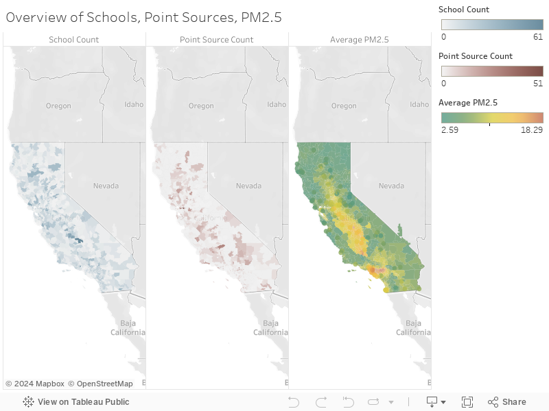
The schools, pollution sources, and PM2.5 levels can be digested more easily by viewing separate maps side-by-side. This visualization shows these quantities by zip code.
Modeling
Instrumental Variables Regression
We model each of our health outcomes using a two-stage least squares instrumental variables (2SLS IV) regression. The two modeling stages are as follows:
- Model PM2.5 using our instrument and fixed effects:
- Model the 12-month change in medical diagnoses using this predicted PM2.5 and same fixed effects:
\[ \widehat{PM}_{2.5}=\beta_0 + \beta_1 \kern 0.05em I + \beta_2 \kern 0.05em year + \beta_3 \kern 0.05em month + \beta_4 \kern 0.05em county + \beta_5 \kern 0.05em temperature \]
\[ \kern 1.5em + \beta_6 \kern 0.05em elevation + \beta_7 \kern 0.05em income + \beta_8 \kern 0.05em population + \beta_9 \kern 0.05em wspd_{avg} + \epsilon \]
\[ Y = \Delta \frac{\sum Diagnoses}{Pop_{zipcode, 0-19}} = \delta_0 + \delta_1 \kern 0.05em \widehat{PM}_{2.5} + \delta_2 \kern 0.05em year + \delta_3 \kern 0.05em month + \delta_4 \kern 0.05em county + \delta_5 \kern 0.05em temperature \]
\[ \kern 6em + \delta_6 \kern 0.05em elevation + \delta_7 \kern 0.05em income + \delta_8 \kern 0.05em population + \delta_9 \kern 0.05em wspd_{avg} + \epsilon \]
- \( \widehat{PM}_{2.5} \) = the predicted PM2.5 9-month average for every zip code and month
- \( \beta_i \) = the first stage regression coefficient for variable i
- \( \delta_i \) = the second stage regression coefficient for variable i
The medical diagnoses in our study are likely to develop over long term exposures to PM2.5. This is why we used a rolling 9 month average of PM2.5 to predict each medical diagnosis. The medical outcomes are measured as the change in the number of diagnoses per 1,000 children over a 12-month period, where the medical counts in a given month are measured as the sum of total diagnoses over a 3-month period. We applied this regression framework to each of our ten medical outcomes of interest.
The instrument, \(I\), is calculated using several different variables involving wind, pollution, and distance variables. We considered the nearest 15 pollution point sources to each school, and for each, we used their PM2.5 emissions measured in tons per year (TPY), distance to the school, wind speed, and wind direction to compute this instrument:
\[ I_{zmy} = \sum_{ps^{*}=1}^{15} \sum_{d_{m}=1}^{D_{m}}\sum_{H_{d}=1}^{24}\theta_{downstream_{zd_{m}}} \times \widetilde{TPY}\kern -0.2em_{ps} \times S_{zd_{m}} \]
- \( zmy \) = zip code, month, and year combination
- \( ps^{*} \) = pollution point source prefiltered to only include those with average TPY levels greater than 4
- \( D_m \) = number of days in month
- \( d_m \) = day of month
- \( H_d \) = hour of day
- \( \theta_{downstream_{zd_{m}}} \) = wind bearing in relation to each school
- \( \widetilde{TPY}\kern -0.2em_{ps} \) = point source pollution output (TPY), scaled using standard scaler, followed by min-max scaler
- \( S_{zd_m} \) = wind speed
Instrument Demonstration
We have included a video which helps to illustrate this instrument calculation and how it was used to predict PM2.5 levels at each school.
Results
Stage 1 Regression
The first stage regression model predicts a rolling 9-month average PM2.5 value for each zip code and month. While this model includes several fixed effects for its predictions, the primary variable of interest in this equation is our instrument, I. Because our instrument combines 4 different variables, its unit of measurement is uninterpretable. However, the low p-value indicates that the model is confident that the true impact of our instrument on PM2.5 is not 0.
To examine the strength of our instrument, we ran an F-test to measure the confidence that our instrument was able to improve PM2.5 predictions over using the fixed effects alone. Generally, an instrument is considered to be sufficiently strong if the F-statistic is greater than 10. With an F-statistic of over 1,000, we can be confident that our instrument is helping us to predict PM2.5 values more accurately.
| Instrument Coefficient | p-value | 95% Confidence Interval |
|---|---|---|
| -0.000107 | 4.02 e-07 | [-0.00015, -0.00007] |
| F-Statistic | p-value |
|---|---|
| 1314.9 | 3.41 e-287 |
Stage 2 Regression
The medical outcomes are measured as the change in the number of diagnoses per 1,000 children over a 12-month period. The results of the stage 2 regression are in the table below. For each medical outcome, we have included the summary statistics for both the predicted PM2.5 value (\( \widehat{PM}_{2.5} \)) and the true PM2.5 value (\( PM_{2.5} \)).
We observe that \( \widehat{PM}_{2.5} \) is a statistically significant predictor of blood vessel diseases and all malignant cancers at the 95% confidence interval level. As an example, we can interpret the coefficient for blood vessel diseases to be as follows: as the rolling 9-month average PM2.5 rises by 1 TPY, we expect the annual change in diagnoses of blood vessel diseases to increase by 0.0072 cases per 1,000 children. The model is 95% confident that the true impact of PM2.5 lies between 0.0019 and 0.0135.
The statistics under the \( PM_{2.5} \) section show the results of the OLS regression using the same
fixed effects as before, but by substituting the predicted PM2.5 with the true PM2.5 value.
Doing so produces a much more biased estimate of the impact of PM2.5 than the instrumental variable results.
Many coefficients from this regression are not statistically significant and have wide confidence intervals.
| Disease Category | Summary Statistics for \( \widehat{PM}_{2.5} \) | Summary Statistics for \( {PM}_{2.5} \) | ||||
|---|---|---|---|---|---|---|
| Coefficient | p-value | 95% Confidence Interval | Coefficient | p-value | 95% Confidence Interval | |
Blood Vessel Diseases |
0.00772 | 0.00993 | [0.0019, 0.0135] | 0.00035 | 0.825 | [-0.0028, 0.0035] |
All Malignant Cancers |
0.00788 | 0.0372 | [0.00048, 0.0153] | 0.000677 | 0.145 | [-0.0024, 0.0016] |
Cardioresp. Cancer |
0.00250 | 0.412 | [-0.0037, 0.0086] | 0.00078 | 0.459 | [-0.0014, 0.0029] |
Type 1 Diabetes |
0.00383 | 0.475 | [-0.0069, 0.0145] | 0.00038 | 0.195 | [-0.0020, 0.0095] |
Non-Blood Cancers |
-0.00129 | 0.718 | [-0.0084, 0.0058] | 0.00028 | 0.183 | [-0.0014, 0.0070] |
Blood Cancers |
0.00782 | 0.227 | [-0.0050, 0.021] | 0.00517 | 0.148 | [-0.0019, 0.0012] |
Blood Diseases |
-0.00530 | 0.131 | [-0.0122, 0.0016] | 0.00291 | 0.234 | [-0.0019, 0.0078] |
Blood & B.V. Diseases |
-0.00121 | 0.750 | [-0.0088, 0.0064] | 0.00238 | 0.369 | [-0.0029, 0.0077] |
Injuries/Accidents |
0.01039 | 0.868 | [-0.114, 0.135] | 0.00795 | 0.811 | [-0.053, 0.069] |
Counterfactual Analysis
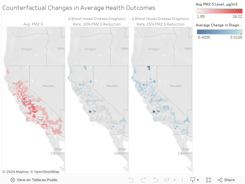
After determining which medical outcomes are most related to PM2.5 through the instrumental variables regression framework, we conducted a counterfactual analysis to see how the predicted number of medical diagnoses would differ under various levels of PM2.5. The purpose of the counterfactual analysis is to show how the predicted medical outcome would change under scenarios with lower PM2.5 values. We chose to conduct this counterfactual analysis on blood vessel disease because this medical outcome showed statistically significant results from our instrumental variables regression.
In order to make these predictions for the counterfactual analysis, we used XGBoost. XGBoost allows us to model the nonlinear relationships between our variables, which provides an advantage over OLS. We first used XGBoost to predict PM2.5 values in the first stage regression, with the same fixed effects that we used in our two-stage OLS model. Next, we used these predicted PM2.5 values with the same fixed effects to train an XGBoost model to predict blood vessel disease. Then, we altered the test data by decreasing the PM2.5 values by certain percentages to see how the blood vessel disease cases would change.
The choropleth maps to the right show the PM2.5 levels in red. The zip codes that show the biggest decreases in blood vessel outcomes as PM2.5 levels decrease are highlighted in blue.
Stanford University Maternal and Child Health Research Institute Symposium
Resources
Team

Trevor Johnson
trevorj@berkeley.edu

Matt Lyons
mattslyons@berkeley.edu

Anand Patel
anand.patel@berkeley.edu

Michelle Shen
michelleshen@berkeley.edu
Acknowledgments
Several subject matter experts and professors were instrumental in aiding the success of our project. We'd like to thank the following people:
- Cornelia Ilin, Ph.D. for the project ideation, continual guidance throughout the process, and for encouraging us to submit our abstract to Stanford University's Maternal and Child Health Research Institute Poster Session.
- Alberto Todeschini, Ph.D. for his guidance and for encouraging us to present at UC Berkeley's AI Research (BAIR).
- Dr. Matthew Meyer and Dr. Kyle Enfield of UVA Health for helping us narrow down our list of pediatric medical diagnoses to study in our research.
- Robert Davis, Ph.D. for sharing his expertise in bioclimatology and for helping us understand the factors for spreading PM2.5.